Translate
Thursday, 30 October 2014
Vintage Clothes from the 1920's to the 1980's
Vintage Fashion Complete by Nicky Albrechtsen, published by Thames & Hudson Ltd London, 2014, pages 18, 24, 25, 35, 36, 37, 59, 66, 75, 79, 85, 93, 108, 113, 129, 134, 140, 144 & 146.
I looked at this book about vintage clothing, I thought some of the clothes from the 1920's to the 1980's look very interesting because each piece of garment had a story to tell and interesting historical facts about some of the garments.
I would love to wear vintage clothes but I can never find any in my own size and I don't know where any of the vintage clothing shops are.
My favourite eras of vintage clothing are the 1920's, 1950's and 1960's because they used interesting embroidery and patterns in the clothes that were created during these eras.
WGSN is a trend prediction company and website that shows the latest fashion news and predicts future trends in different areas of fashion such as colour, kidswear, menswear, womenswear, visual merchandising, youth, footwear and accessories etc.
http://www.wgsn.com/content/board_viewer/#/54692/page/2
Light and sweet pastel colours remained airy for S/S 15, but tones were saturated. Sea green and whisper blue had a dusty but rich look, with pale pink and chamomile yellow adding a delicate appeal. Lavender and shades of coral rounded out this whimsical palette.
Thursday, 23 October 2014
About Trend Stop
Trend stop is a trend agency and online reports that is for trend forecasts, colour forecasts, global street style, footwear forecasts, materials and textures and Print & graphics. Also it has it's own blog.
MILAN FASHION WEEK S/S15
- http://blog.trendstop.com/2014/09/milan-fashion-week-ss15-round-up/
Trends
http://www.trendhunter.com/
This trends company website shows the latest trends everything from fashion, Interiors, beauty and culture etc.
These are some of trends which are currently popular
http://www.trendhunter.com/trends/halloween-lip-art
I love this trend for lips because it is very unsual and weird but in a great way.
http://www.trendhunter.com/trends/wow-design-scene-exclusive
I love this trend because of use of pattern and colour and I think it also does have a 1960's feel to the clothes.
Possible Report ideas for Professional Studies
These are my four ideas I might base my report on for Professional studies they are working in a art Museum or Gallery, fashion stylist, Fashion Print maker and working in art and design with people who have autism.
I look at these in future posts and Professional Studies session with Jane.
I look at these in future posts and Professional Studies session with Jane.
My own Drawings for Digital applications for Fashion and Gift Module
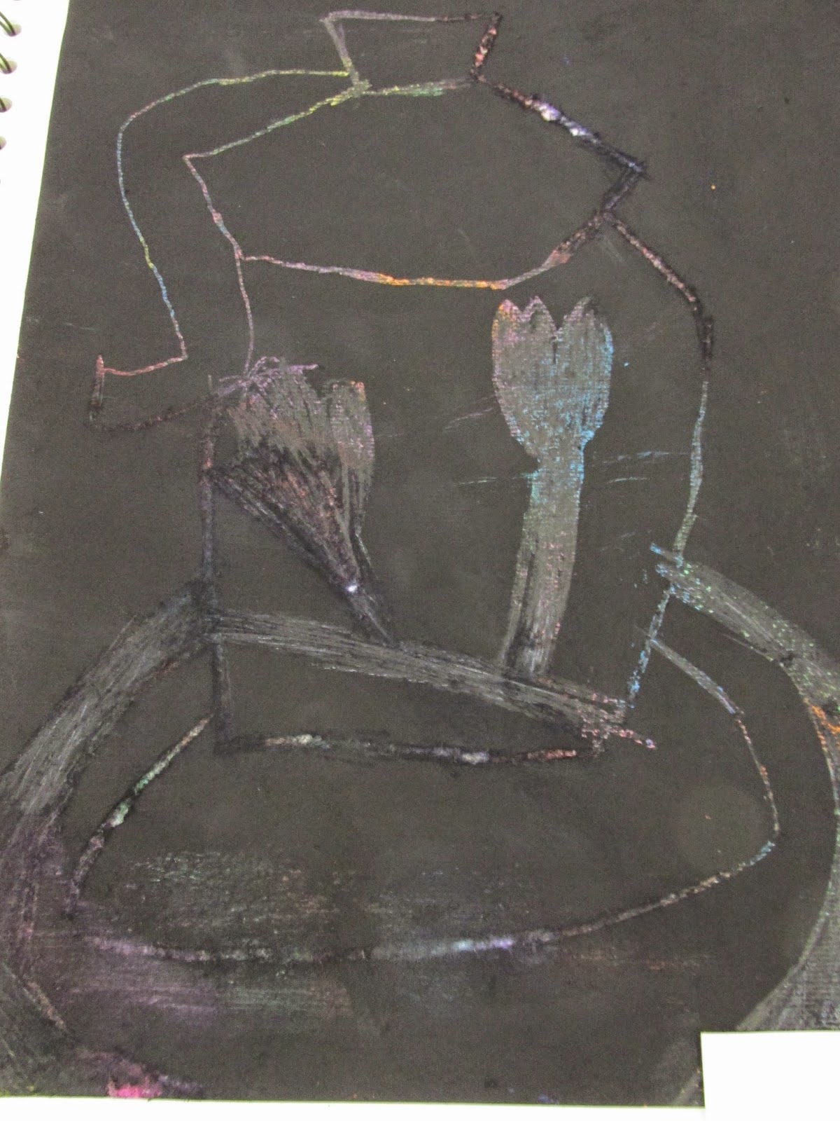
These are my own multi-media drawings I created in studio for my module, which is CAD in Art and Design for Fashion and gift. For my Concept I have chosen fantasy/ fairytales mixed with a bit of a Burtonesque style to my drawings and for this module.
Thursday, 16 October 2014
Creative Business Paperwork
 https://www.pinterest.com/pin/574560864934735971/
I think this business card looks professional and creative and all the important contact details to be able to contact the Company.
 https://www.pinterest.com/pin/574560864934735962/
This CV looks interesting and appealing but on two of the past job roles it doesn't mention the start and finish dates. It looks very professional because of the way of layout and presented.
 https://www.pinterest.com/pin/574560864934735951/
I think the layout of the invoice looks too creative because focuses too much on the visual aspects rather than the important information needed to run a business.

https://www.pinterest.com/pin/574560864934735939/
I think this contact looks very business like and professional what needs to go in a contract because the designer/ employer needs to know what he/ she is agreeing to.
 https://www.pinterest.com/pin/411727590908002855/
I think these letterheads look professional and visually interesting because they are easy to recognize.

https://www.pinterest.com/pin/54746951694224251/
I think this CV looks neat, tidy and very professional because she has given all the important information need for a CV and nothing is missed out.
http://blog.nextdayflyers.com/5-big-business-card-mistakes/
This business card looks rubbish because it looks very pixielated, you can't always see the writing and the image, it looks very unprofessional.
http://blog.nextdayflyers.com/5-big-business-card-mistakes/
This business card looks it has too much information on, too many different fronts and the images are too small because of the amount of information on the business card. A good business card should have good spelling and grammar, a clear image, writing and the only thing you need on a business card is your company name, telephone number, email address and website.
Career Options Yes and No
I was thinking about what possible careers I would like to do after I graduate from CCAD. I have separated into careers I would enjoy and I would not enjoy.
Possible Careers
Possible Careers
- Fashion Women'swear (dresses, t-shirts, leggings, skirts, jackets etc)
- Fashion Accessories (hats, headwear, scarfs, handbags, necklaces, bracelets, charms and earrings)
- Museums and Galleries
- Printing
- Fashion Styling
- Interiors
- Furnishing Fabrics
- Working in Primary School
- Working with children full time
- Sportswear/ outdoors
- Menswear
- Freelance
- Knitwear
Thursday, 9 October 2014
National Glass Centre Sunderland
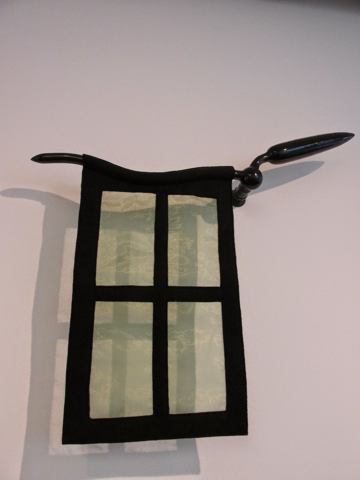
I went to the National Glass Centre in Sunderland with My Mam and my baby Cousin Lucy, I looked at Glass exhibition called Twice Upon a Time by Richard Meltner. Some of artwork that was made out of glass was very eccentric, weird and unusual, it used a lot of bold, outrageous and vibrant colours and I also think it had a bit of a Burtonesque style to the glass designs, but I loved it and goes well with my chosen concept for gift and fashion design.
Own Photographs by Bethan Gillan
Own Photographs by Bethan Gillan
Subscribe to:
Comments (Atom)


